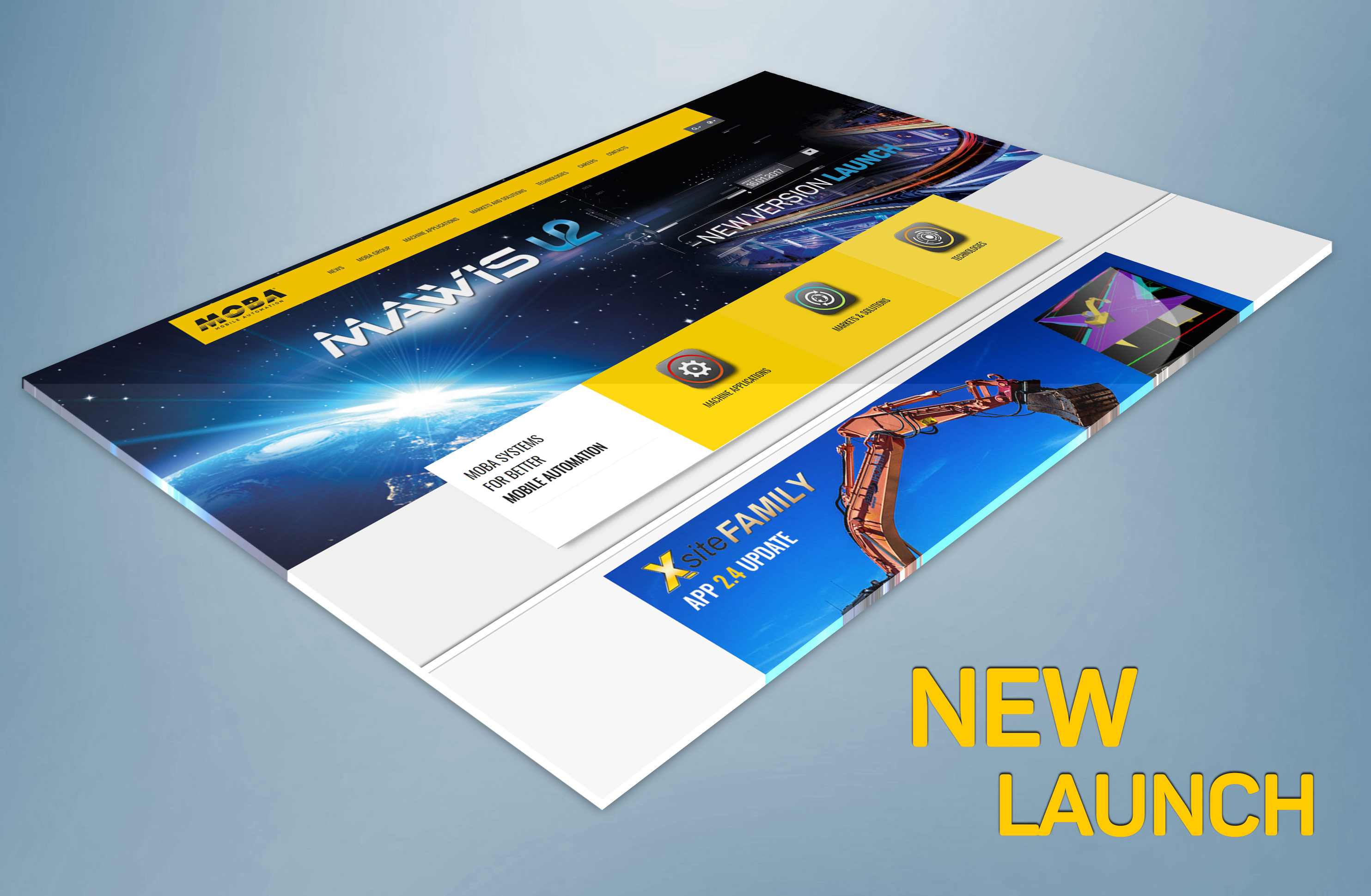
Fast, clear, intuitive
Thanks to the extremely short loading times and new features, such as the extended search or the direct access to all contact persons, the visitor can reach his or her goal even faster. In the download area, one will find all relevant information from brochures to press releases at one click. New, high-res photo and video galleries invite the visitor to explore the MOBA product world.
Up-to-date and in-touch
The integration of the MOBA Community as well as the MOBA platform offers even more features. In this way, interested parties can directly subscribe to the new MOBA newsletter, search for specific products, and download related product pdfs. On all application pages, relevant expert contributions from the MOBA Community are now directly listed. In the next few weeks, international pages of MOBA’s subsidiaries will follow on the new technology base.
Logo Refresh
With sharpened optics and newly defined lines, the logo looks clearer and tidier. It remains true to itself and guarantees a high degree of recognition. The new "Mobile Automation" lettering also received a fresh look and looks much more modern and straightforward. The new look embodies the values and philosophy of a leading technology company.


